
The skinny
Problem: Several HR-related functions at the UW were coming together under one banner after the purchase of a Workday subscription. We were tasked with making a website covering all self-service HR needs.
Outcome: A successful, on-time, on-budget site launch with an integrated information architecture that we made sure was comprehensive and easy to navigate. Happy users, happy stakeholders.
What was done and why
The name “Integrated Service Center” doesn’t exactly roll of the tongue, does it? (Probably why they’ve since changed it.) But it does adequately describe the situation both before and after its existence. Prior to 2016, The University of Washington had a confusing web of disparate HR service depts and websites. No shade intended on them in specific – this sort of fragmentation and siloing happens in large organizations all the time. Luckily there exist plucky UX designers and researchers to help figure out a way to put all the pieces together.
And that was our charge, in a nutshell. The UW’s decision to hop on Workday’s platform had them concluded that this transition wouldn’t work with a random hodgepodge of websites run by different departments. What the HR functions were, who would own them, how they hooked into Workday… all these were upstream of the project. I worked as both designer and researcher alongside other designers, web devs, stakeholders from UW HR, and consultants from Workday as we spent nearly a year ideating, iterating, and building a WordPress-based HR website to rule them all. (If you’re surprised it took a year I envy your lack of exposure to higher ed politics.)
Setting aside agreeing on a visual design, figuring out the information architecture was the biggest task. Have you ever used an HR website you loved? Us, neither, so we got to work figuring out how.

We started off scrappy. Everyone on the design team was a user of UW HR, as were our leadership, so we sat down and brainstormed what questions people would ask of HR. (We started with what users might want first, that’s always so important.) Then we did a content audit of the current HR sites, matched content with questions, and tried to figure out what questions the content that wouldn’t match was designed to answer.
There were still a lot of questions, so we put together an old-school card sort – with physical cards and everything – in order to get a broader view. (And because we were using fellow employees as the participants, it didn’t cost us nothin’!)
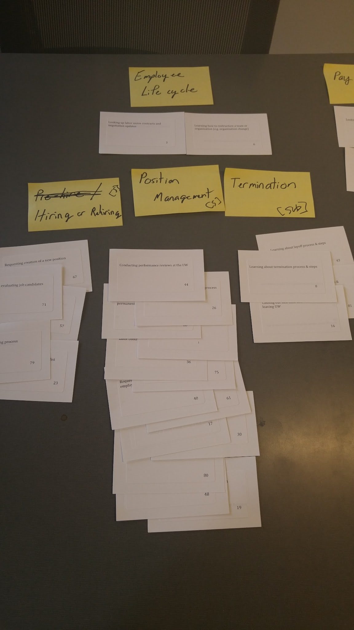
Which I ran through some card sort analysis software and, in concert with my fellow designers, put together final recommendations for the structure of the IA (shown partially here) and, through user testing, landed on a second-person content strategy.

What happened
A successful website launch, much as you see it in the featured image. As stated, there were a lot of cooks in this kitchen so we had to compromise on some decisions, but I remain really proud of that information architecture. Usability and tree tests revealed that it worked really well and, because we could demonstrate that, we were able to get all of the content stakeholders to agree to it and undertake an enormous amount of work to reformat all their content to fit within that structure.
