
The skinny
Problem: The Dynamics 365 Field Service team had an idea to revamp their mobile app and enable field worker freedom. Would it work?
Outcome: We learned the refreshed app would have been a hit with independent field workers, but that’s not our audience. Our audience are enterprise-size field service operations and this vision did not fit in with the management culture there. However, the enhanced visuals were a hit all around! So we were able to reap the benefits of the time spent on the visual treatment without engineering what would have been a boondoggle of an app.
What was done and why
At one point in my Microsoft career I worked in Dynamics 365 for Field Service. The Field Service team provided a mobile app for the technicians that connected back to the main app but it was perpetually in rough shape. It met the technical requirements for it to be a workable tool while workers were out and about but the grumbling about it was frequent and loud; good enough to be a selling point for the C-suites that made the decision to buy Dynamics 365 for Field Service, but fell well short of the ideal experience for the everyday worker.
When a product has gone on in this state for a while, when the bubblegum and band-aid fixes just aren’t cutting it, sometimes the best way forward seems to be a redesign from the ground up. The team had just hired some new PMs and designers who saw the problems with the current app and wanted to try out some blue sky thinking to find the ideal mobile app experience.
Leadership saw the appeal but were worried about the opportunity cost of working on a risky new idea instead of fixing known problems. I was part of these discussions and suggested a Concept Evaluation as a way to test these ideas before things got too far down the road; we’d spend a sprint or two making the concept the best we could and leadership would have to agree that things looked promising before we continued any further. Plus, I argued, even if the concept didn’t continue on we’d learn valuable things we could bring back to the main products.

It’s a technique adapted from marketing that mitigates the tendency for participant to imagine a future where the interface presented solves all their problems and, therefore, says that it will. The team merely had to whip up a quick prototype (lo-fi would have been fine but the designers went hi-fi) that allowed us to walk the user through the features of the app and the way it would work, much the same way a director might pitch a movie to producers with storyboards. Additionally, the team had to come up with a list of benefits and limitations or tradeoffs.
We also recruited together as a team to make sure we found the participants that we all felt were the perfect kind of users for the new concept. Using some recruiting platforms I found ~30 people who seemed like a good fit and we whittled it down to 10 and then conducted the sessions.
What happened
A significant portion of the participants turned out to be “player coaches” – folks in supervisory roles that still went out on jobs or at least did so in the very recent past. I say “turned out to be” as though it were an accident, but we purposefully chose people that could represent multiple perspectives and it was a very wise choice. Because a lot of our data ended up looking a lot like this:
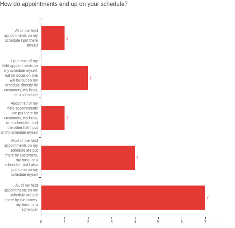
That was a sign that we were on the wrong track. Let me explain. We had designed an app that intended to provide a better experience for field workers by making them more independent, thus more efficient and more empowered. The problem turned out to be that enterprise-level field service organizations don’t really have that kind of culture. They believe it’s not only more efficient to centralize a lot of the scheduling and customer service, but provides a more consistently high quality experience for the customer as well. So, while some participants who were entry level or who worked for firms or industries that were a little different liked the concept quite a bit, we determined that a lot of the folks who pushed back were also the folks that looked a lot more like our customers.
As a result, we abandoned the new concept after one cycle. Which is good! Imagine if, like New Coke, they’d gone all the way to market before they learned that?
Plus, like I’d promised management, we did learn things that could apply to our business more broadly. For instance, the new concept had considerably more visual style and polish than the app currently in the field and people liked it so much that, as often happens with great visual design, people were clearly rating it more highly than they objectively should have given the tenor of how the conversations went. So, while the idea of a new app and some of the new functionality had to be scrapped, we were able to convince leadership to invest in a visual refresh for the current mobile app. UX is more than just UI but… hey, better is better.
