
The skinny
This is an exemplar of one of the dozens and dozens of benchmark studies I have run in the past 7 years. The problem and goals are straightforward: routinely update UX Metrics (time on task, etc) to let the team know whether they are moving the needle year over year and to help them identify and prioritize the issues that will improve those metrics the most. The details, however, hold quarter for many potential devils. Read on to find out how I produce these effectively.
(also these slides are my own template, the team template was very boring.)
What was done and why
To run a Microsoft-style benchmark study, one first needs to identify the audience to study as well as the 20% of the product workflows they use 80% of the time. (I.e. what features in the product have to work in order for them to even begin to care about the rest?) When doing this, I always choose to have a round table or workshop with key stakeholders to review what those workflows would be.

I do this even if I have analytics and well-researched personas to lean (as I did for this Customer Service Hub benchmark). Any evidence I can bring guides the discussion but additional stakeholder input is also considered and valued. If they aren’t bought in, what’s the use?
Once the audience and tasks are decided, recruit as many people as you have time and budget for (10 at minimum), time them as they complete tasks, and then conduct analysis.
What happened
Presenting the topline findings in attractive way that also highlights yoy change is necessary, but insufficient for inspiring change in the product. (And I do hope you’ll forgive things being blurred for confidentiality.)
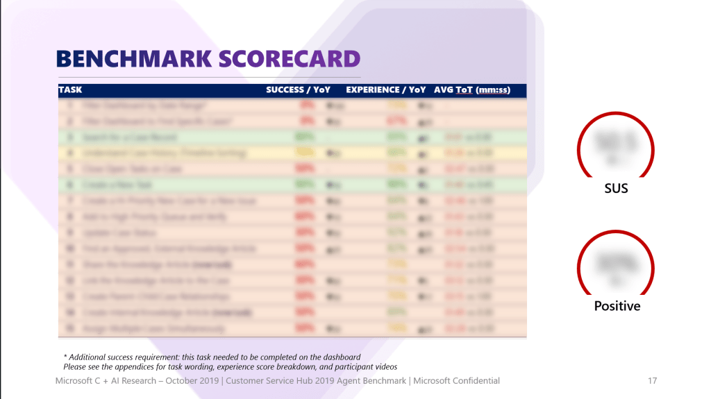
In past benchmarks, I found that doing work up front to get buy in from stakeholders is likewise necessary, but insufficient. The people who actually have to implement changes to improve the UX are not always in the room and once the findings go through the game of telephone down to them they don’t always understand.
With this benchmark, instead presenting findings task by task, I presented them theme by theme and tied each theme back to tasks and even past benchmark findings.

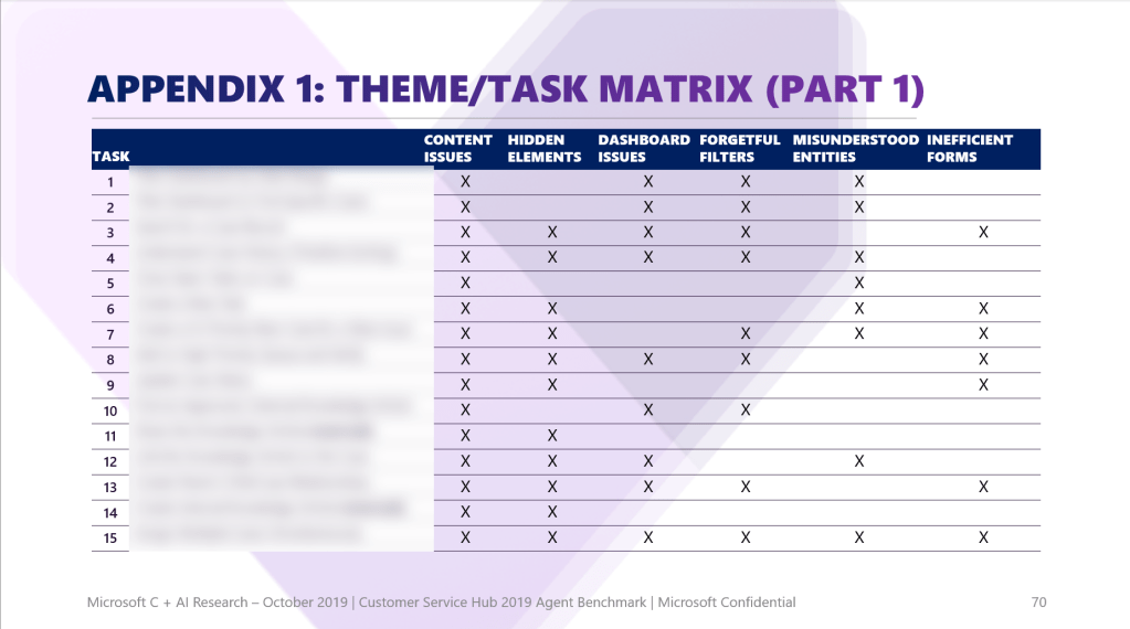
In this way, the thematic findings were at once harder to brush off and easier to fold into product work; when the findings seem like they’re 1,000 little cuts split into a bunch of different tasks, who has time to fix that? But when it becomes clear there are root issues that can be tackled that can raise the water for many boats at once? It’s easier for people to take on board because they can already see the impact they’ll have by fixing it.
I have shared as much UX reporting on Customer Service Hub as I can here, but I can assure you that benchmarks done in later years that built on the insights here showed marked improvement – which only happens if things get fixed!
